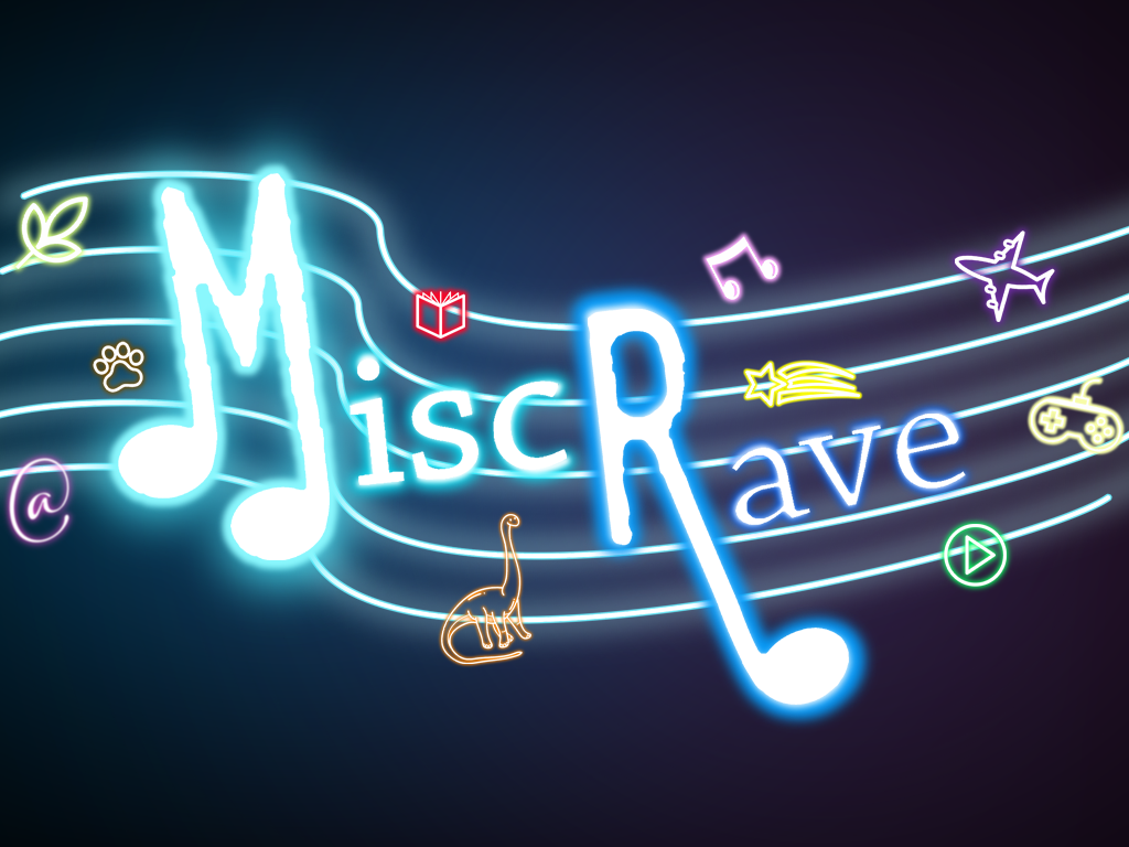
MiscRave has gone through a few different logos the 5 years that it’s been here so let’s take a look at most of them from when the site first went live to today. This page will also be updated with any new logos so even if they’re made after this original post, the article will continue to be updated with all the latest and greatest MiscRave.com evolution.
I had waited for a long time to get the site have a perfect launch but this made it so the site had been waiting to be launched for a long time and one day I decided that if I didn’t go ahead and begin with something then it would never happen. So in this case the original logo was put together quickly on paint. I like to call it the dino logo or beta logo. SOmething basic but at least the site would have some icon and banner when it first launched.
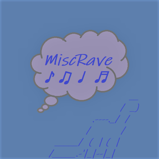
I really love it and wish it had been used more, I’ll try to bring it back a bit more often but it also inspired later versions of the logo.
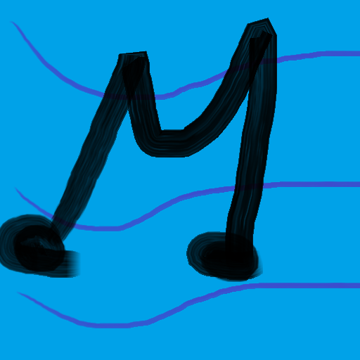
I quickly changed it to something that I thought was a bit more original, it was meant to be a placeholder until I could get something better but it hung on for a little bit more time than I would’ve liked. I decided to have two versions for a banner and an icon instead of one size fits all like the beta logo.

I call it the paint logo and it’s a bit embarrassing looking back but as I mentioned it was supposed to be there long term. It was still better than nothing and gave me the opportunity to work on the site while having some sort of identity.
![]()
Eventually I was able to get a better version of what I pictured in my mind with the first miscrave logo. I really liked the icon version of it and used it for a long time. Even when it was meant to be replaced it hung on there since I had gotten used to it.

I was happier with this version of the miscrave logo since it was what I always pictured but of course a bit amateurish but the site was ready for full action with it.
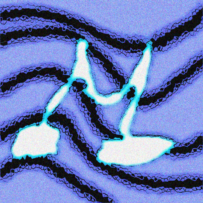
Eventually I got a better version of that same idea made, a bit more professional with help from a graphic designer. I was so happy with the previous version that I didn’t want to dwell too different from it. The icon actually became the digiculture podcast logo so I continued to use the previous icon for all this time as well.

But the banner is what I used for quite a while since it’s what I liked until it started to feel a bit dated and not as fancy or ravish’ as I would’ve liked and that’s when I got a graphic designer to make something new
![]()
For the icon I think I went a bit too simple and I’m unsure if I should’ve made it a bit different since it looks like just I cropped the banner. But I ended up going with this one for now at least.
For the banner I just wanted it to look mostly the same but have a few more things sprinkled out of stuff you might find here without being too explicit since it’s a miscellaneous compendium of all things that rave.
We’ve also had other banners:

Originally I meant to change the banner up every once in a while but this ended up not happening, this is one of the few that made it on the site for christmas. I hope for the future that I am able to do this more.
while finding the right banner choice there are some that just don’t make it, there was originally a version of the 5th banner with a pokeball to make reference to the site’s origin in 1999 but opted of not having it since it’s not my main focus.
Other banners were gone through for example this one that looks a bit too 80s so it was never used
and here are just some rough drafts to get the ideas of what the site banner was supposed to be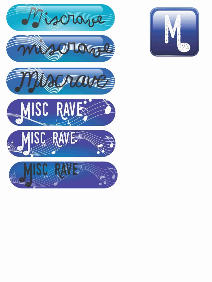
The future of miscrave logos include more themed ones depending on the season as well as doing a few more wild takes on banners
